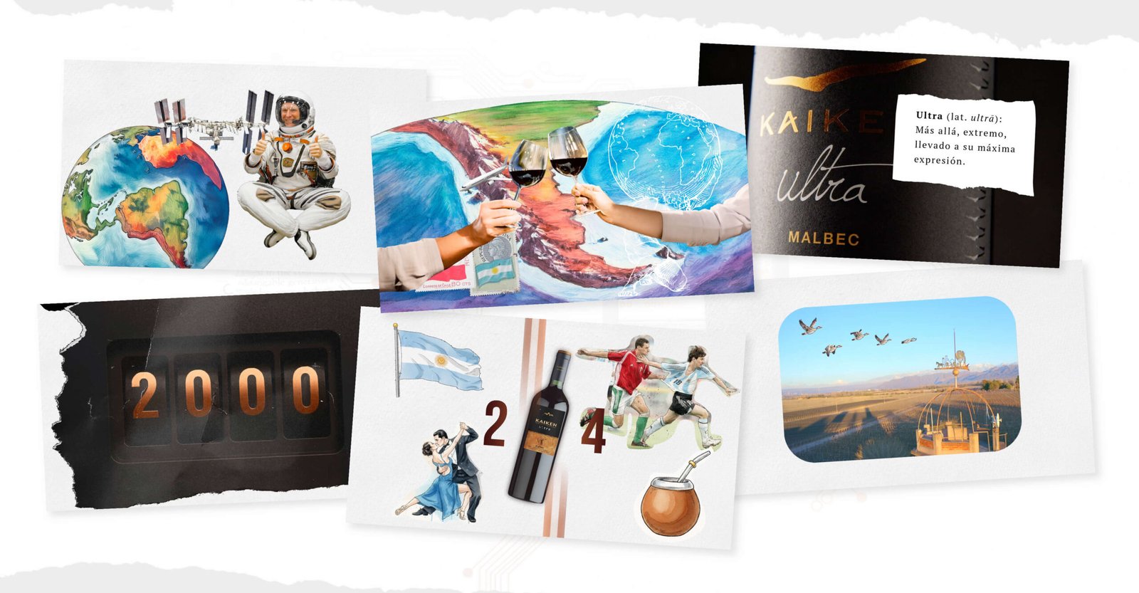
Creative idea, script, art direction, editing and motion graphics.
Say a lot with little
Building a brand with an identity sustained over time is a complex task. Communicating it, even more so. Especially when it comes to a winery like Kaiken, whose path rests on a clear vision: to create wines with character, consistency and international reach.
Within that journey, Kaiken Ultra holds a central place. Since its first vintage, more than 20 years ago, the line established itself as a benchmark, combining oenological precision and personality.
The creative challenge was not to tell that story again, but to find a contemporary language capable of concentrating it.
Condensing 20 years into a few minutes
The project’s starting point was a simple but demanding question: how do you talk about track record, excellence and tradition without falling into familiar formulas or a nostalgic tone?
The answer was in the approach. Instead of a testimonial or chronological account, we opted for a piece where synthesis was the main value. A video designed to say a lot with little, where every word, every shot and every transition had intention.
Motion as narrative language
At Argency we worked the creative idea, the script, the editing and the art direction as a single system. Motion graphics were not an ornamental resource, but the language chosen to structure the discourse.
Typography, rhythm, silences and visual composition work as an expanded script. The text does not accompany the images: it builds meaning. The editing sets the pulse of the story and reinforces a key idea associated with Kaiken Ultra: precision.
Art direction
When the product is solid, design organizes and amplifies, it does not distract.
Ultra as a symbol
In the video, Kaiken Ultra does not appear as an SKU or as an isolated product. It works as a symbol of a way of doing things: constancy, coherence and long-term vision.
In this way, the piece not only communicates a line of wines, it reinforces the overall positioning of the Kaiken brand.
Communicating is a craft too
This project distills a conviction that runs through our work: communicating brands with history demands the same level of rigor as building them. Thinking through the language, choosing what to say and what to leave out, designing the right rhythm and tone.
When excellence becomes tradition, the communication has to live up to it too.
We communicate brands with the same precision with which they are built