Packaging design, portfolio architecture and meaning-building.
Two opposing outlooks that coexist within a single collection
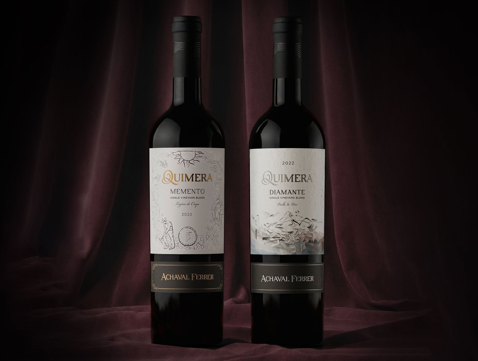
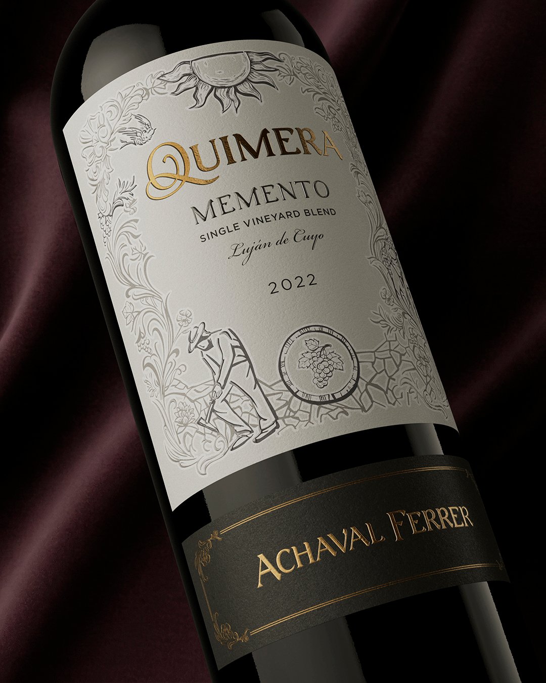
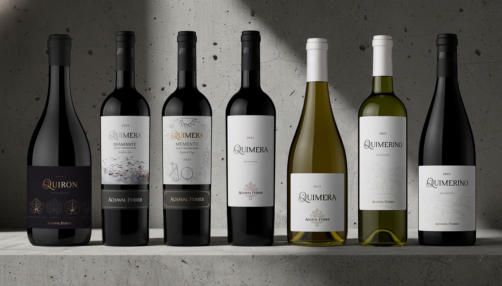
Quimera Diamante and Quimera Memento arrive to complete Achaval Ferrer’s pyramid of blends.
They are the most recent addition within the Quimera universe and the result of comprehensive brand-building work developed by Argency: packaging design, definition of portfolio architecture and meaning-building so that each wine occupies a clear place and adds value to the whole.
The challenge
Achaval Ferrer, one of the most renowned wineries in Argentina, presented us with a twofold strategic challenge: integrating a recently acquired winery into its brand universe and, at the same time, expanding and reorganizing a portfolio historically associated with single vineyards, with a single emblematic blend (Quimera) and entry-level varietals.
The challenge was no small one: preserving prestige and tradition, while giving the brand greater dynamism, new narrative layers and different points of entry for diverse audiences, without diluting its identity.
Brand architecture
The strategy
We defined a new brand architecture built on two main pillars:
Achaval Ferrer, as the house of high-end varietals specializing in Malbecs Centenarios.
Quimera, repositioned as Achaval Ferrer’s house of blends.
Following this logic, each wine had to occupy a precise place within a coherent pyramid, where the sum of the labels would strengthen the whole system.
Portfolio architecture
Each wine had to occupy a precise place within a coherent pyramid.
Tradition and avant-garde
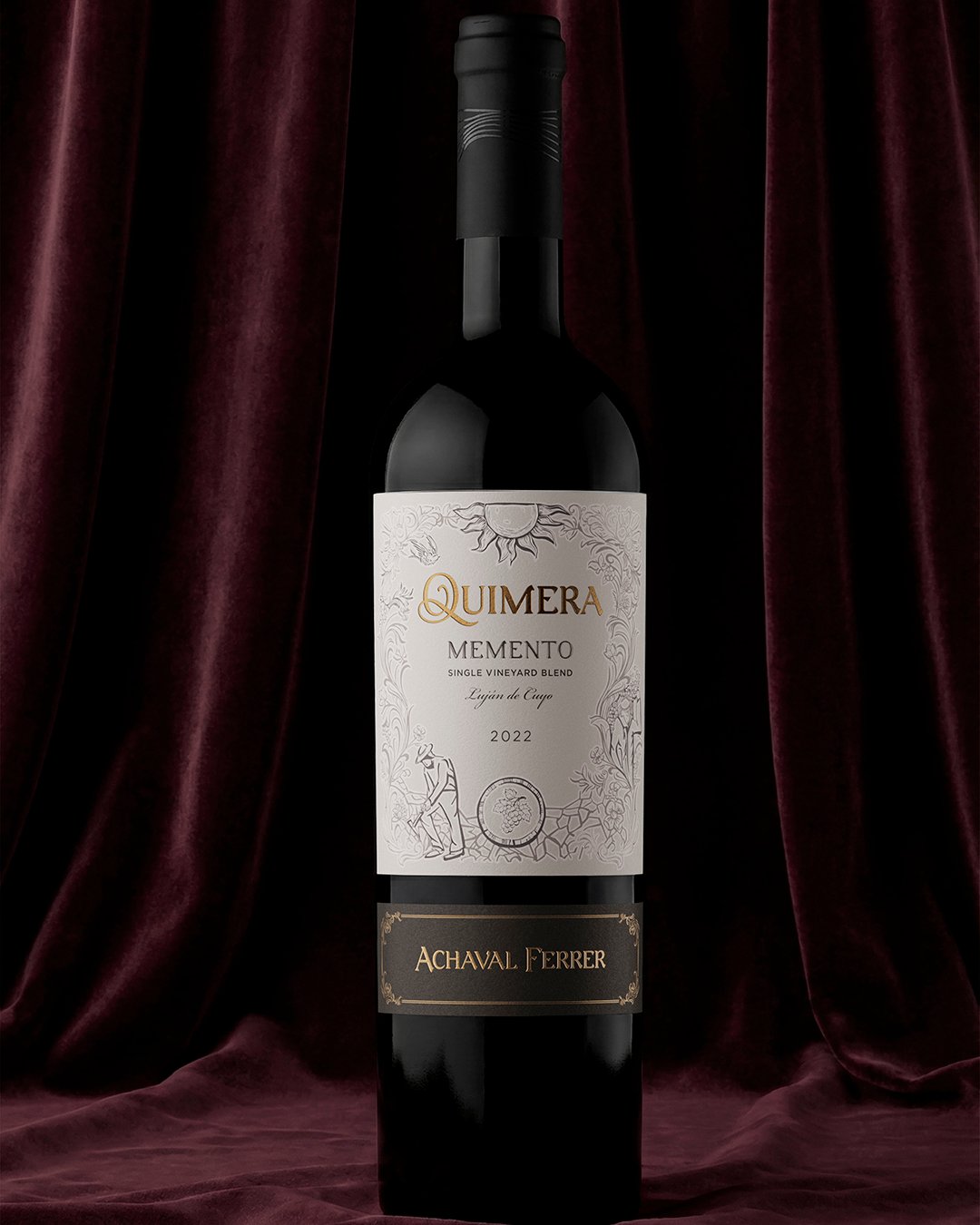
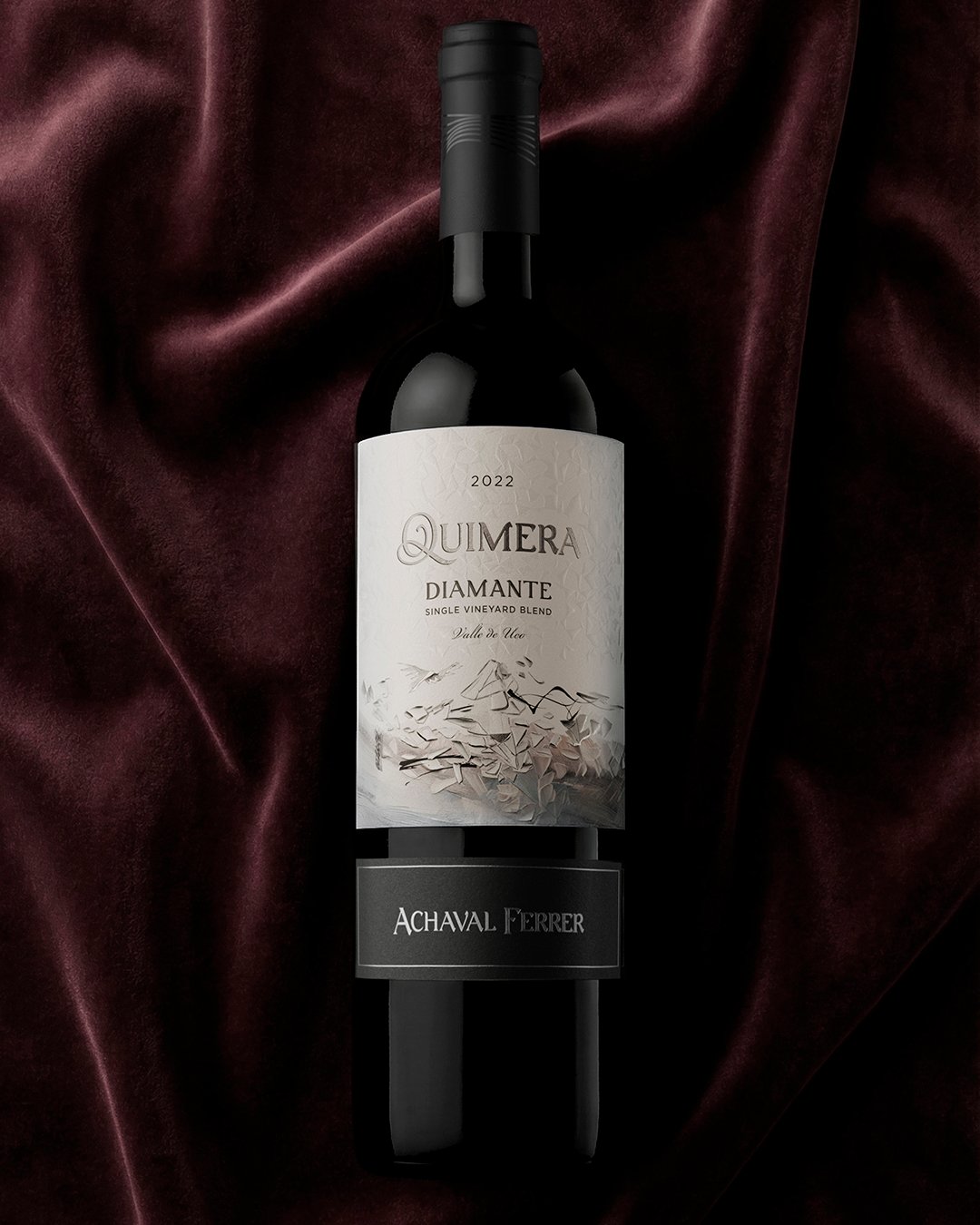
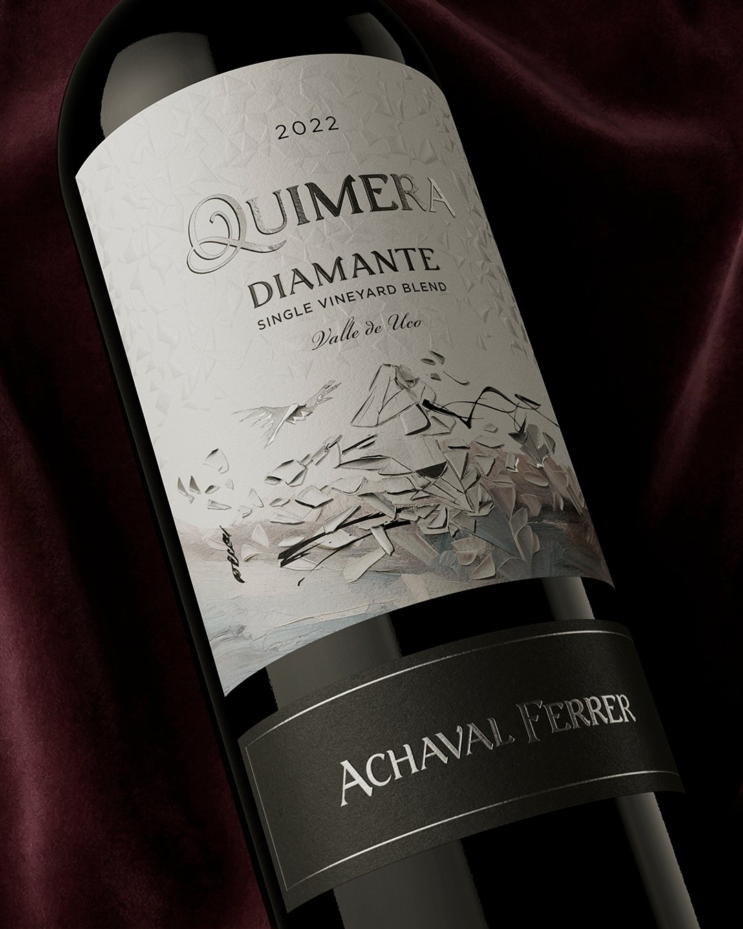
To close this pyramid, we designed Quimera Memento and Quimera Diamante, working with a founding duality: tradition and avant-garde.
Memento is born from memory: a detailed illustration, an ornamental frame and gold foil stamping that pay tribute to the work of the immigrants and to the historic viticulture of Luján de Cuyo.
Diamante looks ahead: a dreamlike landscape, a minimal composition and silver foil stamping over a white and gray palette, expressing the innovation of Valle de Uco and its contemporary practices.
Two opposing outlooks that coexist within a single collection, united by the architecture of the label, the neck label and one same Quimera universe.
The Quimera system
The complete system is built on this foundation. The starting point was the redesign of the Quimera logotype: a classic typeface crossed by a spiraling “Q” that symbolizes the unattainable pursuit of perfection, the conceptual essence of the brand. Achaval Ferrer remains as a signature, in the background.
The Quimera label adopts a minimalist, elegant and sensory language: textured oblique lines that represent paths, search and depth.
The extensions are born from this system:
Quimerino, a younger and fresher blend, where we recreated a mythological creature out of the same graphic universe of lines.
Quirón, the icon wine of the pyramid, which represents the wisdom needed to make a field blend whose blending begins in the vineyard. The different varieties coexist in a single block, are harvested and vinified together, finding order within disorder. This logic is rendered visually through an ampelographic study laid out in a clean and minimal way, unifying label and back label on a single canvas.
Impact
The result is a clear, consistent and expressive pyramid of blends, where each wine fulfills a defined role and strengthens the overall perception of the brand.
More than adding labels, the project made it possible to order the portfolio, expand the story and project Quimera as a living system, able to grow without losing its identity.
We design systems that grow without losing their essence