
– What do I wear?! That is the question every bottle of wine asks itself before going to market.
– First of all, you have to define a style that identifies you. An image consultant would tell it.
– But, can someone describe to me what the styles are, as far as wine labels go?
After a long time of conversations with different clients deciding which paths to follow in packaging projects, I found myself needing to establish a code in order to speak the same language. So as to define clearly what the client needs and what style best defines their wine, their winery. So I gathered the courage to put together the following classification.
Today we can say that there are as many styles as there are wines on the market, which is why it becomes hard to establish categories.
The criterion used here is according to the consumer profile the wine is aimed at:
CONNOISSEUR
Traditional Style
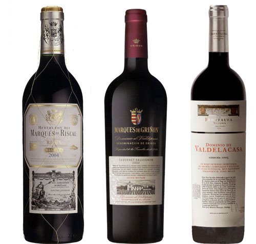
This kind of label is classic and elegant. In the style of French labels. Conceptually they appeal to tradition, prestige, family, the chateau, distinction , sobriety and style.
They are generally large, white or beige, and printed on textured papers that denote high quality. They have a lot of information, since this consumer does not only buy a wine to taste it, but also enjoys learning and decoding fairly specific particularities of the product, communicated through the label and back label. For this reason, they have more text than image. The typefaces tend to be English or Roman, and the iconography appeals to heraldry or engravings of vineyards, wineries, palaces, castles, harvesters, the grape harvest, etc. The technological resources they use are limited to embossing dies and stamping.
Many can fit into the postmodern style I describe further on.
They are expensive and exclusive wines, limited batches, that do not need to compete on supermarket shelves. Their most important asset is the winery’s brand, the wine’s history or the winemaker’s signature.
AMATEUR
Just as on wine labels for to experts the axis is information, in packaging aimed at amateur consumers everything is based on the world of sensations. The pleasure of these people is that of sharing a good moment. Having no specific knowledge, this kind of consumer chooses a wine based on the packaging and/or the brand.
They generally choose easy-drinking wines with a good price-quality ratio. This is the most fragmented price segment, which is why it is imperative to stand out, to catch the eye on the shelf.
They are modern, fresh and original labels. With the visual style linked to new world wines. In this kind of packaging the idea is to innovate, whether from the concept or from the form. It is very important to highlight the significant role of production technologies, the different materials, inks, varnishes, laminates, traditional and holographic stampings, embossing, die-cuts that many times are the protagonists on the label.
The information they contain is practical: brand, varietal, advice about drinking on the back label; they can also tell an original story.
As for visual styles, anything goes. Although ”the modern” could be reduced to 3 trends: Minimalist, transgressive and contemporary classic.
Minimalist Style
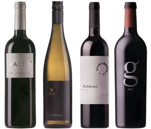
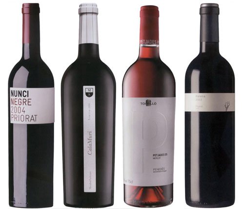
Large, clean labels, reduced to the essential, stripped of any leftover elements. Through this simplicity the aim is to give prominence to the sensuality of the wine. Some detail makes the difference: it can be an icon, a different shape, a cut-out, an embossing. Although sometimes the typeface is the only visual element. They are elegant and glamorous. They tend to be asymmetrical compositions. They use textured papers, that can be “felt”. They can also be “no label look” on transparent materials, much used for premium and fashion wines. They have the elegance of simplicity, the seduction of things that do not try to seduce.
Transgressive Style
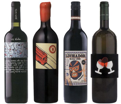
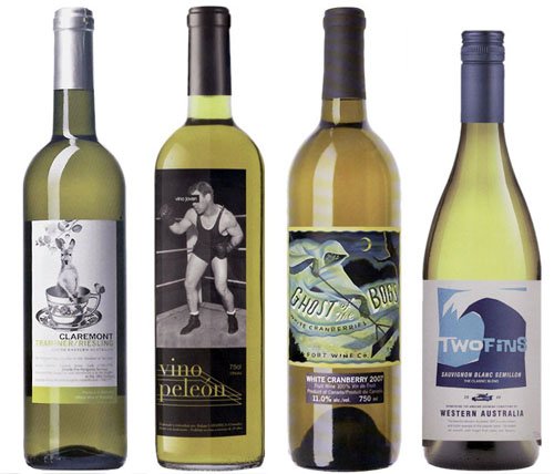
Labels that tell a story through characters or creatures that demystify the origin and the drinking of wine. They are disruptive and provocative. They narrate stories that have little to do with the traditional concepts of the vineyard and the winery. They invite the consumer to discover wine through other paths. The idea is to transgress through an alternative iconography.
They are cheerful and vibrant. The use of color and of image –iconographic or photographic – are characteristic of this kind of packaging.
The concept of pastiche characteristic of postmodernity is present in many transgressive labels, since they draw on different aesthetics taken from other contexts. Everything is reinvented to create new elegant and contemporary forms. They are hybrid and eclectic. In these cases more is better. Anything goes.
Contemporary Classic Style
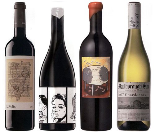
Labels that sit between the classic and the modern. They aim to be traditional but they use contemporary codes in order to speak to the new consumer. They are the labels that answer the producer’s typical request: “I want something traditional, but modern” They combine the structured side of the classic with emotion and subjectivity. I think they currently dominate the market, since somehow most people like them, “they are always right”.
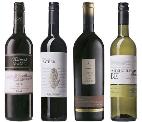
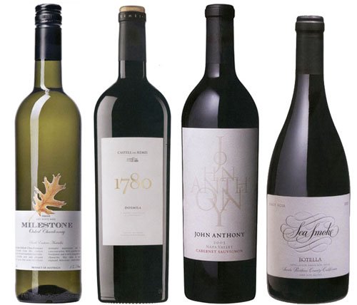
Of course this kind of classification is fairly theoretical, since in practice the boundaries between each category tend to be blurred. But I think it is a clarifying contribution for starting to speak the same language when taking on a project. A starting point for knowing where the client wants to go with the communication of their product.