Trends in brand design
Brands are made to last, but none escapes the visual styles of its time.

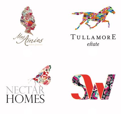
One of the premises to keep in mind when designing a brand is its durability over time: making sure that after a few years it is not perceived as an old or out-of-fashion identity. But we also have to accept that it is inevitable to escape the visual styles of the era in which they are created. Below you will see an interesting categorization of 2010 trends.
These categories were proposed by the editor of Logolounge.com, Bill Gardner, after analyzing more than 35,000 brands sent to him from all over the world to be part of volume 5 of his book.
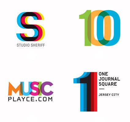
It is interesting to see how, more and more, designers stop taking printing limitations into account and take the risk of using a wide palette of colors, gloss, transparencies and poorly defined edges, adapting more to the RGB world than to the CMYK of printed paper.
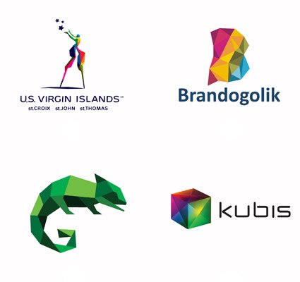
Cubist
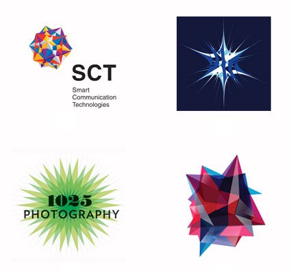
Spores
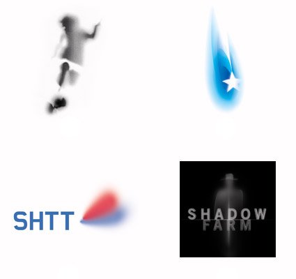
Ghosts
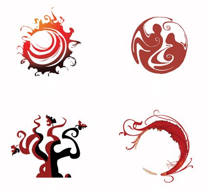
Tendrils
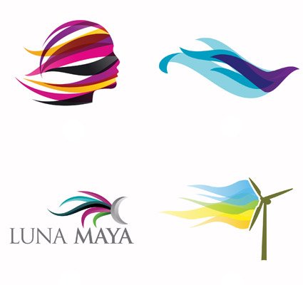
Movement
Pieces
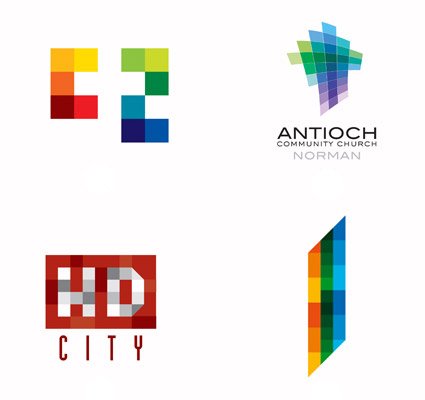
Pixel
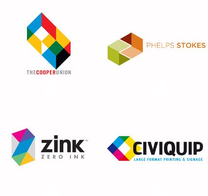
Cubes
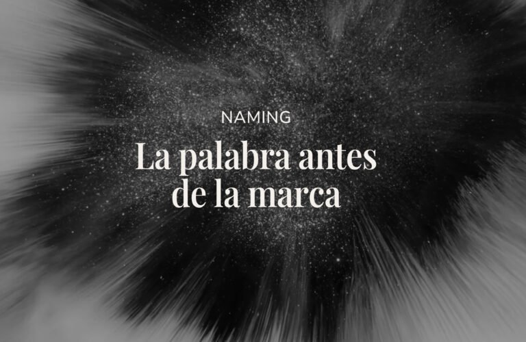
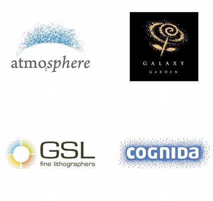
Dust
Garlands
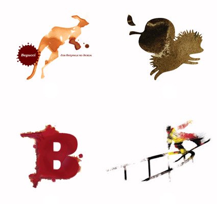
Stains
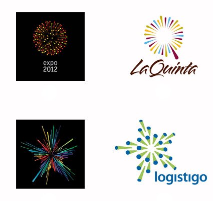
Explosions
Wallpaper