Google and the Material Design revolution
Behind Android’s facelift there is a new way of thinking about interface design.

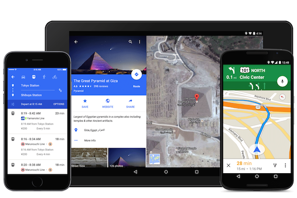
This week Google launched the new version of Android, called Lollipop. And what draws the most attention at first glance, beyond its capabilities, is the new design language, Material Design. However, we are not looking at a mere facelift of Google’s operating system, but at something a little more ambitious. Combining the basic rules of graphic design with new ideas about the interface, Google is betting on establishing improvements in the changing field of interactive design.
Material design is several things. On the one hand it is a cleaner and more functional design, in which responsive animations and transitions predominate. This poses a new experience around the user interface (UI), which allows communication between the human and the machine.
On the other hand, it is presented as a strategy for unifying and integrating Google’s various products across the platforms and devices it has. A design language built to work not only on phones and tablets, but on smartwatches, wearables, and everything Google plans to invent in the coming years.
Google’s vice president of design, Matias Duarte and his fellow designers at Google see material design as a path toward an emerging discipline. “Material is not just a style but a way of thinking about interface design”, says Duarte. “And we want people to start absorbing that into their everyday practice”.
Back to the source
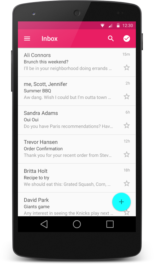
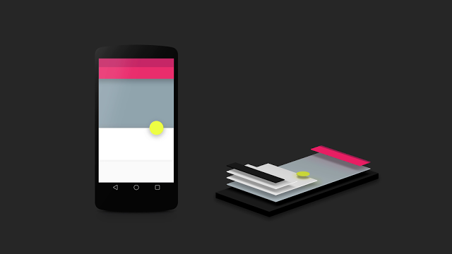
Material design looks different, and as we already mentioned, it is because one of the big changes lies in a new approach to the UI. In Lollipop, every interface is a three-dimensional construction, in which each component behaves as if it were made of a real material. And the thing is that Google based itself on paper to develop Android’s new appearance.
This approach to the physical, together with the use of transitions and animations, aims to make the user’s life easier. By treating pixels as something tangible, our touchscreen takes on a greater sense of familiarity.
Building new rules
Material design has been conceived to improve the service for users, but also to help designers. In a way it is to steer them away from making confusing products, and it likewise provides one of the most complete frameworks of interactive design seen so far.
As Duarte points out, in terms of communicating information, the craft of designing is quite complex. There are rules for creating things, there are guidelines for the use of certain typefaces, how much structure is needed, what the sizes and the spacing between things should be like. This is the kind of thing you learn in design school.
On the contrary, the practice related to interactive design is “quite new”, says Duarte. “They do not have hundreds of years of experience and rules people have to abide by. They have, with luck, a few decades”.

On this basis, material design is an effort to combine that institutional knowledge with what we have learned about interaction in the last decade and what we are learning about new animation tools.
The challenge of becoming popular
Creating a single design language for all of Google’s products is an ambitious project. Getting everyone to follow its complex and bold rules is no easy task, and one of the challenges Google will face in the coming months is precisely getting its radical vision shared by designers outside the company.
But like every new technology or trend, the waters will divide again. Some have mentioned that treating pixels as something “tangible” is impossible. After the manifesto Google published about its new design, the designer Khoi Vinh wrote, “to be honest, I could not make sense of anything it said”.
We also face the possibility that these new rules lead us to a homogeneous ecosystem. Nicholas Jitkoff, one of the project’s leads, says that Google is aware it must leave room for third parties that want to express their own personalities.
All these aspects are debatable, but material design was conceived as something much more than Android’s new look for next year, rather as a vision of the future of how Google might look five or ten years from now. Beyond the philosophy behind how notifications slide or how they group on the lock screen, it is the usefulness they bring with them that really matters to us as users. Yes, it is true, everything looks similar and homogeneous, but nobody can deny its usefulness.
[Sources: Wired and Google]