Rocas de Seña

Packaging
Label
Rocas de Seña
Client
Seña
Industry

Wine · Chile’s icon wine.

Services

Packaging design for the brand’s second wine.

The color blue is the protagonist

Designing the packaging for the second wine of a brand as relevant as Seña was a great challenge. We are so happy with the result that we want to share it 🙂

In the design of Rocas de Seña we recovered many of the pictorial elements of the Seña label, to generate a world rich in visual and tactile textures. The logotype rests on the grace of the flourishes that coexist with and connect to the tilde that is characteristic of the brand of Chile’s icon wine.

Rocas de Seña
Rocas de Seña

The color blue is the protagonist that gives a dose of freshness and sets it apart from its parent brand. Present on the capsule and on the box, which deserves a chapter of its own, not only for the design but for how spectacular its execution is.

Rocas de Seña
More cases
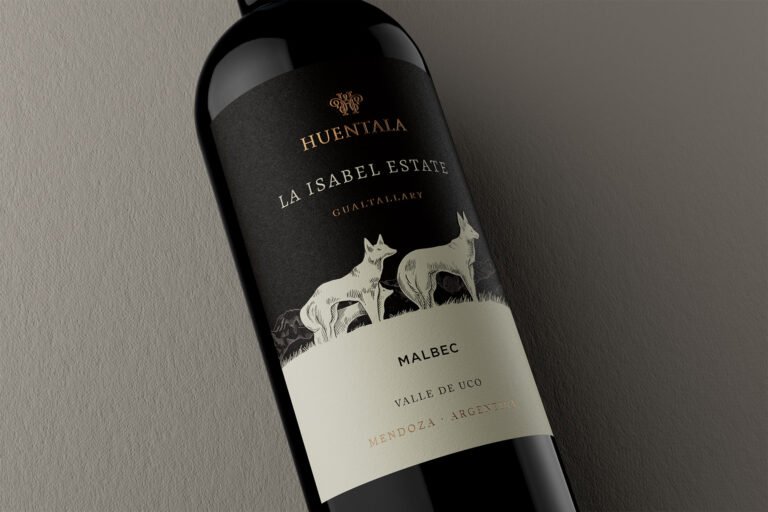
La Isabel Estate. Huentala Wines. Argency. Agencia de diseño y publicidad de Mendoza, Argentina.
Canto Rodado
Wine Packaging
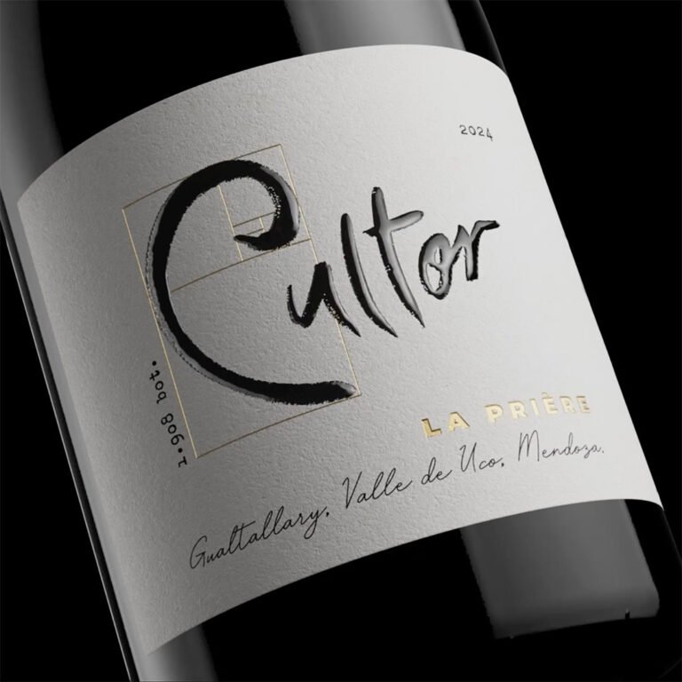
Close-up of the Cultor La Prière 2024 label from Gualtallary, Uco Valley, Mendoza_Argency design and advertising agency. Mendoza. Argentina
Cultor
Strategy
Collage of a smiling astronaut giving thumbs up next to the space station and planet Earth_Argency design and advertising agency. Mendoza. Argentina
Kaiken Ultra
Video
Detail of the black Quirón 2019 Field Blend label with gold grapevine leaves_Argency design and advertising agency. Mendoza. Argentina
Quirón
Packaging