". El CSS va aparte, * en la hoja b3- (hero-video.css). * * QUE HACE. El hero del caso muestra el video del caso en loop y mudo. * La interfaz de YouTube NO SE PUEDE ELIMINAR, solo tapar: cada vez que * el player arranca pinta ~4s de titulo, canal y transporte. Por eso la * foto del caso funciona de TELON — cubre el video en cada momento en * que YouTube muestra marca y se levanta cuando quedo limpio. Mas tres * botones propios (pausa, volumen, expandir) contra la IFrame API. * * DE DONDE SACA EL VIDEO: del widget `video` de Elementor que esta * dentro de .b3-hero__media. Se le lee el `data-settings`, se le saca * la URL de YouTube y despues se lo quita del DOM. El contenido sigue * viviendo en Elementor —el dueño cambia el video desde el editor y * esto lo sigue— pero el player lo construimos nosotros, con nuestros * playerVars, en vez de pelearnos con el de Elementor por el mismo div. * * DE DONDE SACA LA FOTO DEL TELON: ver fabricarTelon(). En orden: * atributo propio, la imagen que ya esta en el hero, la del bloque * b3-mod-boxed, y por ultimo og:image. Sin foto no hay telon, y sin * telon NO se construye el player: seria mostrar marca de YouTube. * * SI EL BLOQUE NO ESTA no pasa nada: las otras 135 paginas de caso * cargan la misma hoja y el mismo snippet, y salen por el primer `if`. * * ⚠️ POR QUE LA API SE PIDE ASI Y NO CON UN
Sin categorizar

Behind every great version, there is a mobile version

The digital newspaper MDZ can now be read on mobile, with an interface designed and developed at Argency.

The mobile version of the digital newspaper MDZ was officially launched. The news deserves a little spot on our blog, because this interface, optimized to make reading and accessing information from mobile phones simpler, was designed and developed at Argency.

In developing this application exclusively for MDZ, we took into account the largest possible number of mobile devices with the capacity to browse HTML sites (not WAP), as well as the pixel density of each one.

So that the design adapts to the different screen sizes, we used adaptive layouts and responsive design techniques.
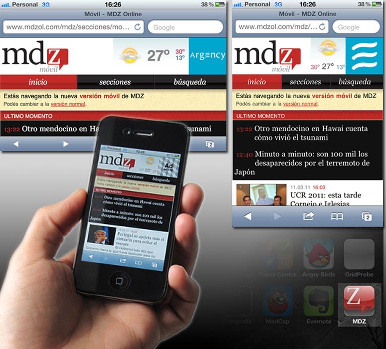
The design follows the lines of the standard site, although for this mobile version we created icons for each of the sections.

We reorganized access to the information through a navigation bar that lets you go to the home, enter the different sections or carry out a search. At the top there is a space for breaking news and the photo galleries can be browsed very easily. Also, all the articles can be shared through facebook, twitter or email.

Now, we are eager to see users’ response. So, we invite you to experience the MDZ mobile experience.

Ignacio Tassi
Seguir leyendo
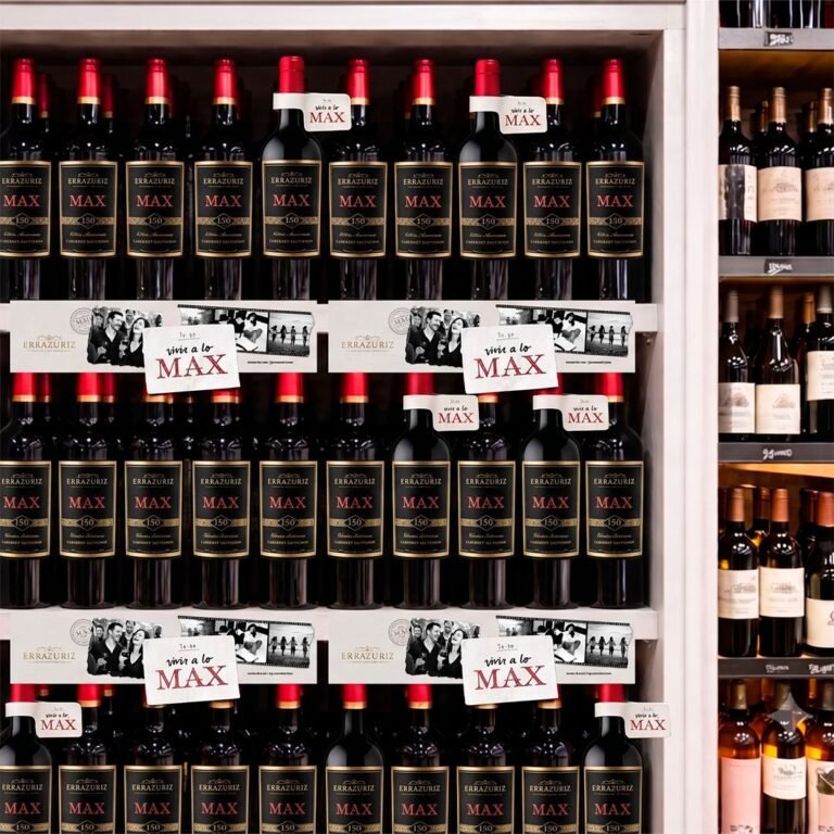
Góndola con botellas Errazuriz MAX 150 años, collarines y cenefas “vivir a lo MAX”_Argency agencia de diseño y publicidad. Mendoza. Argentina
Wine
14 August, 2026

The last meter: why the shelf decides what branding promises

The point of sale is not the end of the campaign: it is where it is decided whether it worked.

“Instagram Study 2026” cover over an orange, pink and purple gradient with wavy shapes_Argency design and advertising agency. Mendoza. Argentina
SOCIAL
19 June, 2026

Instagram 2026: fewer likes, more strategy

Metricool's study of 24 million posts: the way to earn visibility has changed.

Black and white card with a particle burst and the title Naming: the word before the brand_Argency design and advertising agency. Mendoza. Argentina
Argency
20 May, 2026

Naming: The word before the brand

Naming is not choosing a name: it is imagining what a brand can become.